
Andrew Mecum
Pencil Pusher Project: Graphite Zine
Andrew’s Etsy Store
As a longtime lover of printmaking, but semi newcomer to letterpress, it was important for me to really use the type as the catalyst to learn the technical process and get true ‘hands on’ training. I also love that it touches on intuitive applied design decision making, in the analog physical space with unique limitations and constraints.
So what I am sharing here are some examples of this approach. At first they seem straight forward but also slightly askew enough to hopefully tilt the viewers head, and make them think a bit…back up a few steps and consider how subjective words and language are, how much room for interpretation there can be.
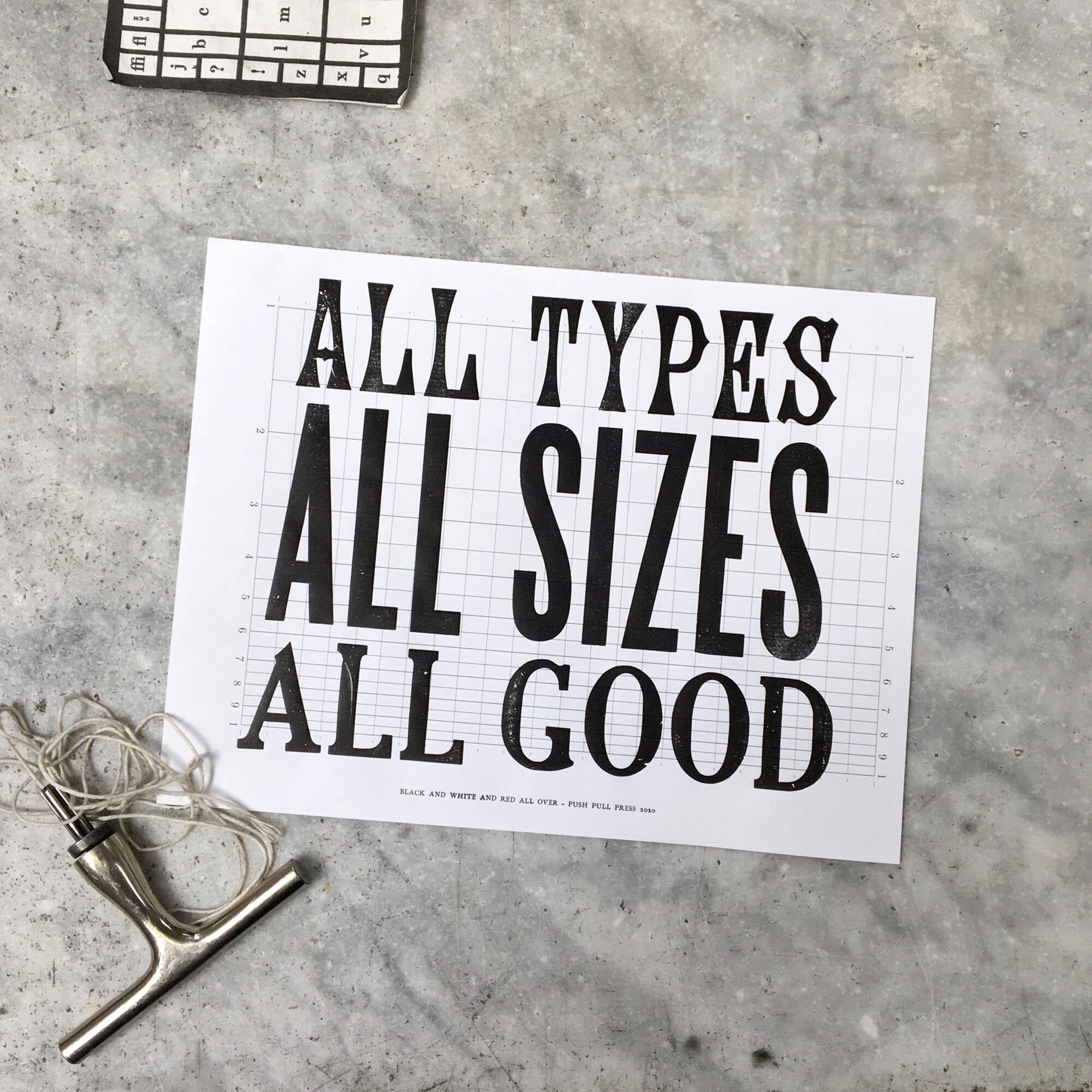
ALL TYPES
Ideas have popped in and out of my head for decades, some get written down, some are forgotten (maybe for the better), and some get turned into prints. This print was both a pun for letterpress nerds, and social commentary about open mindedness and inclusion. These are intended to be given out for free, inquire within.
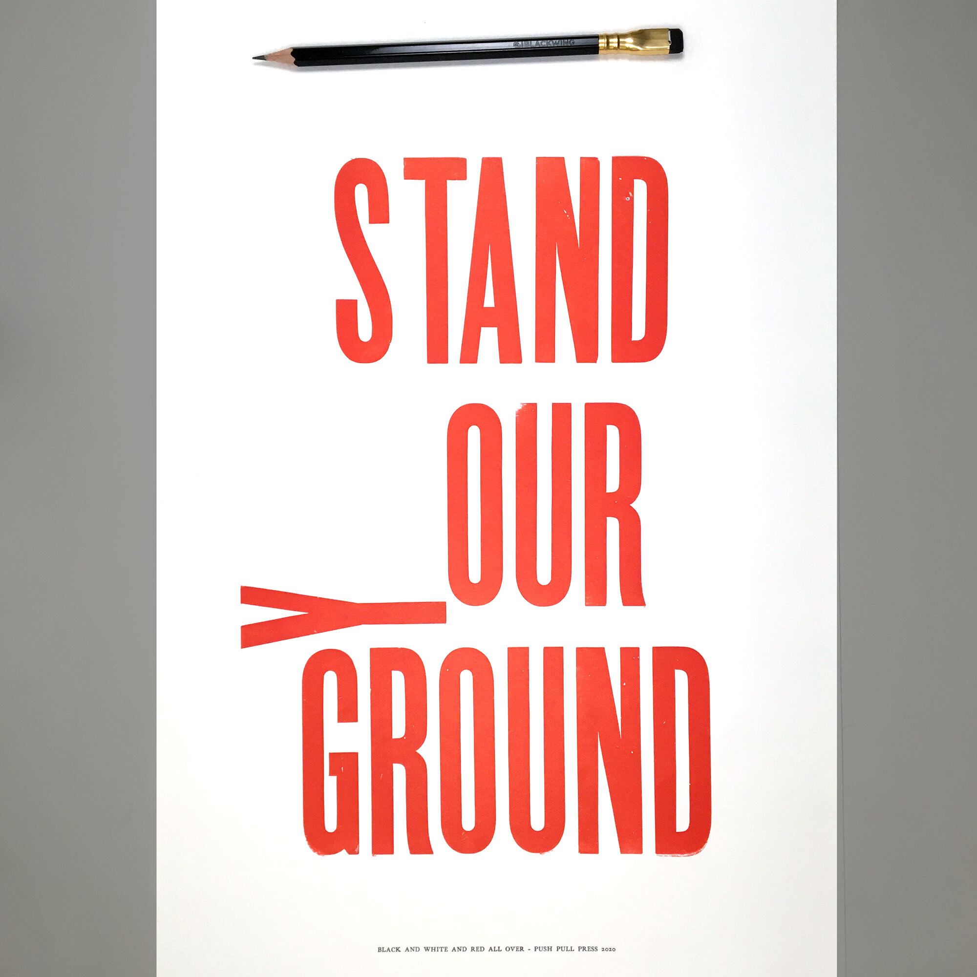
STAND OUR GROUND
This was made as a direct response to the recent movement and protests against police brutality, systemic racism, and gun violence and why we find using guns as a tool for defense and protection a necessary evil. The law it also refers to as it was created is designed to defend someone who feels threatened, and gives them the authority to protect themselves. But where are those lines drawn, what defines being threatened? If a large group in flack jackets armed to the hilt with weapons chanting and yelling angry things threaten me, do I then have the right to arm myself and defend against them? Is that the best society can do, and is this the best way forward? Is it YOUR ground or OUR ground, are we sharing our communities, cities, streets and neighborhoods or just selfishly concerned for our own personal safety and protection?
This print was just 1 of 5 word based prints in my Black and White and Red All Over poster series, and 100% of the proceeds go to those who fight for peace and justice.
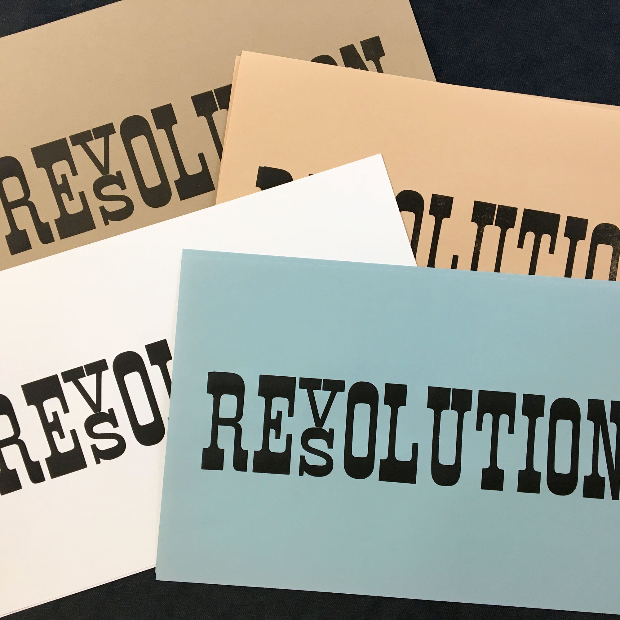
VERSUS
One letter makes quite a big difference doesn’t it? This image is inspired by a sticker I first saw in the late 1990’s that read like the numbers on a gas pump but the with the words IRAQ and the Q was rolling over into an N, as it seemed like eventual the path at the time, and even to this day. I hope not, but only time will tell.
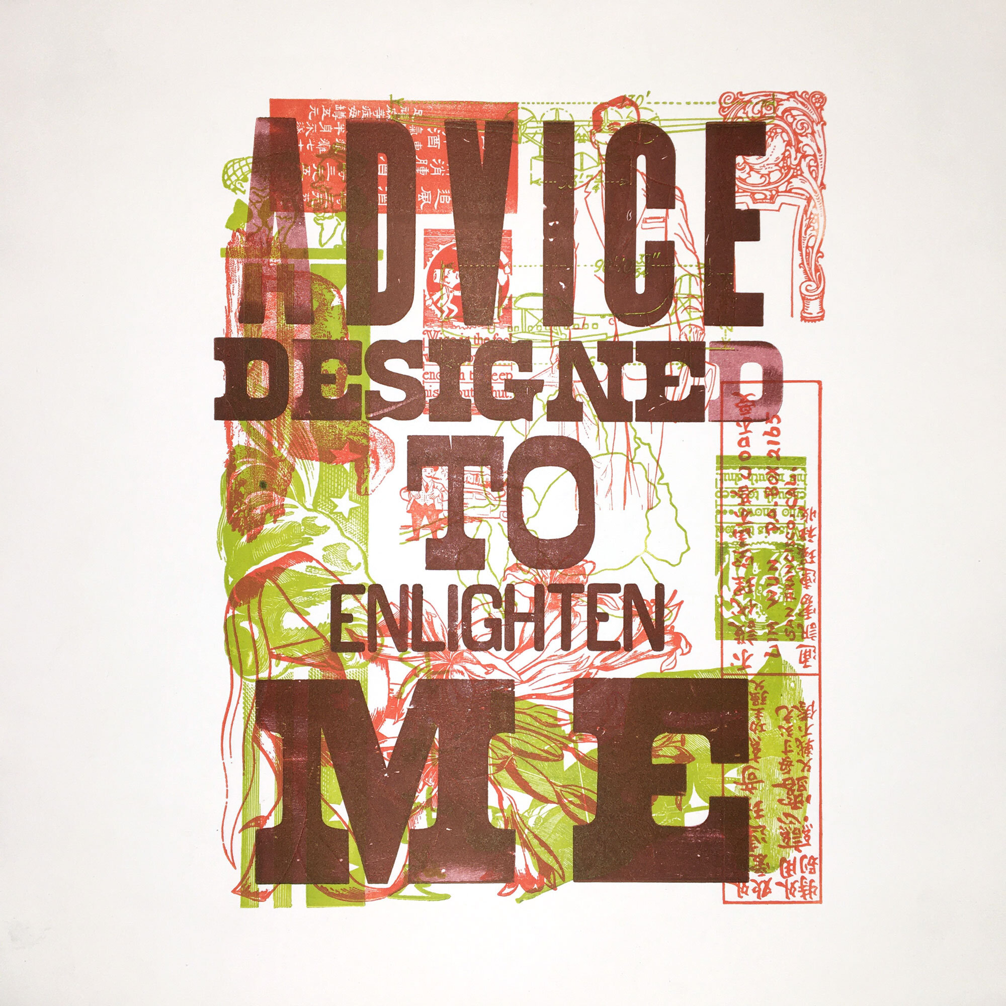
ADVICE DESIGNED
Speaking of those who fight for justice and peace…and the tragedy of gun violence, thank you John Lennon.